


2026 trends. Every year brings a fresh crop of interior trends, each promising reinvention, excitement, and the illusion of newness. Some ideas slip effortlessly into our homes, becoming so familiar we barely register them as trends at all. Others require a leap of faith and occasionally a suspension of personal taste.
While the right designer can make even the most divisive idea sing, there remain certain looks that, for personal, practical, or emotional reasons, simply don’t land. This year, the House & Garden team reflects on the trends we admire from afar but won’t be inviting into our own homes.
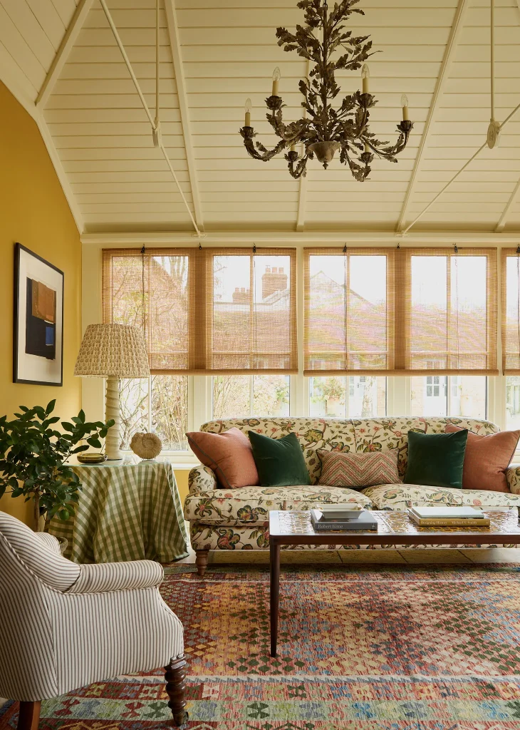
Yellow walls
Warm yellows are having a moment, championed as joyful, optimistic, and sunshine-soaked. In photographs, the effect can be irresistible. In practice, however, yellow remains one of the most temperamental colours to live with.
“I was fully seduced in theory,” admits Virginia Clark, Digital Director. “But once I saw it alongside my green sofa, the whole room veered dangerously into lemon-and-lime territory.” Yellow, she notes, demands absolute confidence in both light levels and furnishings and can quickly feel overpowering. For now, she’s sticking with the gentle familiarity of plaster pinks, a palette once dismissed as passé but increasingly appreciated for its softness and longevity.
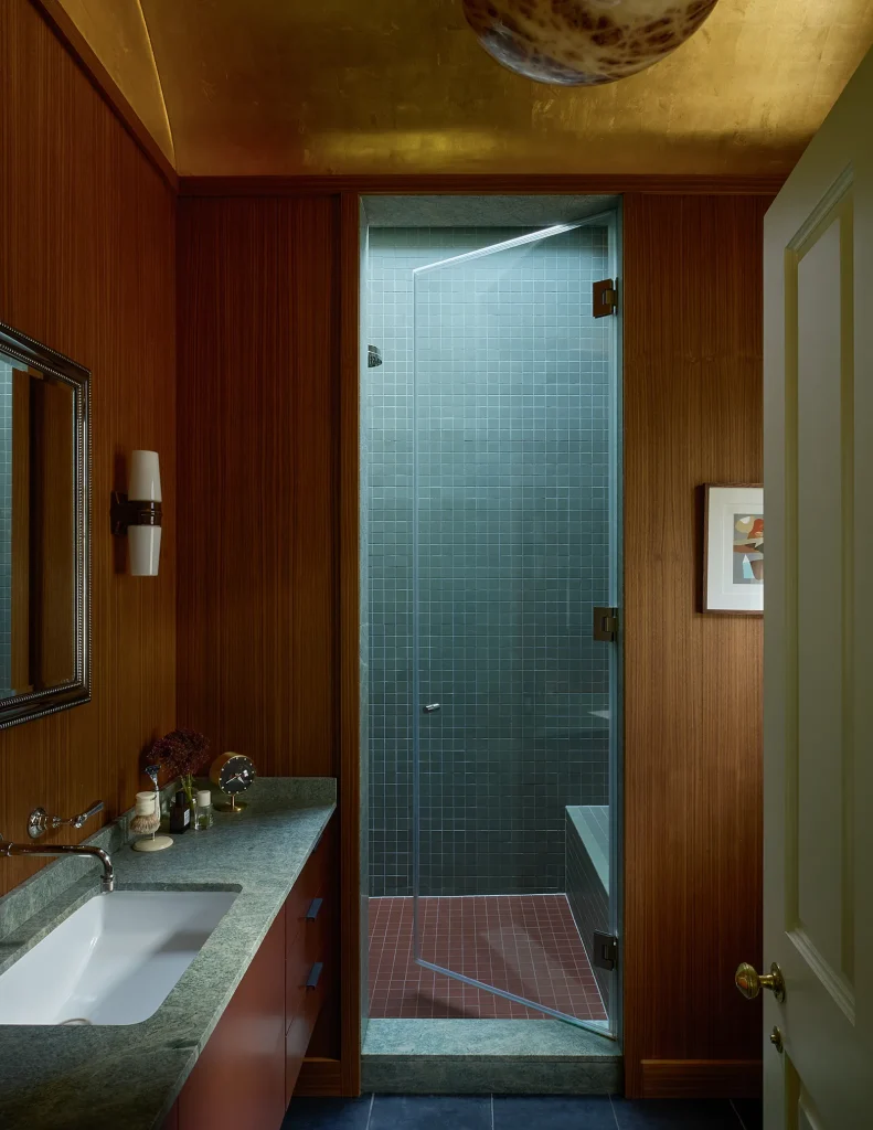
Micro tiles
Tiny square tiles have returned in earnest, lending bathrooms a crisp, artisanal feel. Yet for some, nostalgia works against them.
Christabel Chubb, Acting Deputy Digital Editor, finds the association impossible to shake: “I spent my childhood in swimming pool changing rooms lined with small, square tiles. No matter how chic the colour, I’m transported straight back to damp towels and cold mornings.” While she admires the craftsmanship, large-format tiles win on comfort, both psychological and practical.
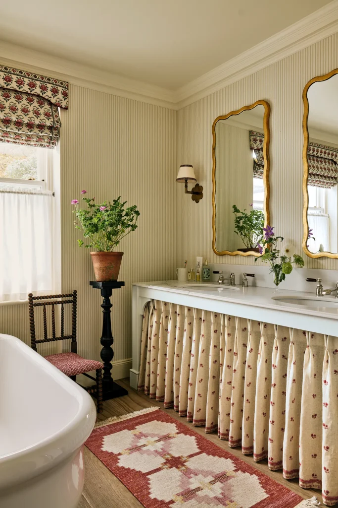
Wallpaper in bathrooms
Bathrooms are increasingly styled as fully fledged living spaces, complete with curtains, artwork, and, yes, wallpaper. Technically, there has never been a better time to paper a bathroom: modern options are durable, breathable, and designed for humid environments.
Still, Rose Washbourn, Digital Writer, remains unconvinced. “It will always feel slightly wrong to me like carpet in a kitchen or tiles in a bedroom.” The fear isn’t unfounded; even the most robust wallpaper requires faith. For Rose, classic tiles paired with resilient paint finishes offer beauty without anxiety.
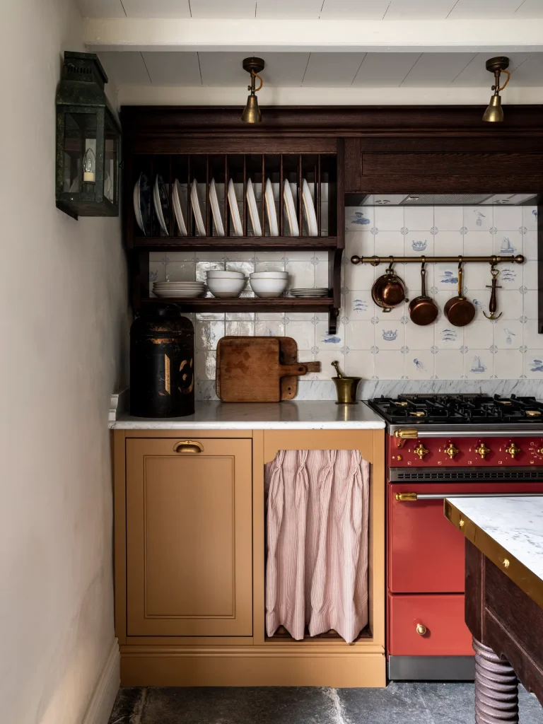
Relentless brown
From kitchens to living rooms, brown has emerged as the grounding neutral of the moment, rich, cocooning, and reassuring. But saturation is a risk.
Eleanor Steafel, Lifestyle Director, draws a distinction between fashion and interiors. “Wardrobes can evolve quickly; rooms can’t.” While chocolate tones feel luxurious now, she’s wary of committing wholesale, preferring pieces and colours that will still feel generous and flexible years down the line. Trends fade; sofas endure.
Pantone’s 2026 Colour of the Year: Cloud Dancer
A “balanced, billowy white” designed to evoke serenity, Cloud Dancer arrives in a world already awash with pale neutrals.
Pratyush Sarup, Director of Content Strategy, is openly sceptical. “If ever there was a time for warmth, depth and emotional colour, this is it.” He advocates instead for hues with soul — terracottas, lilacs, forest greens, and ochre shades that feel human rather than antiseptic.
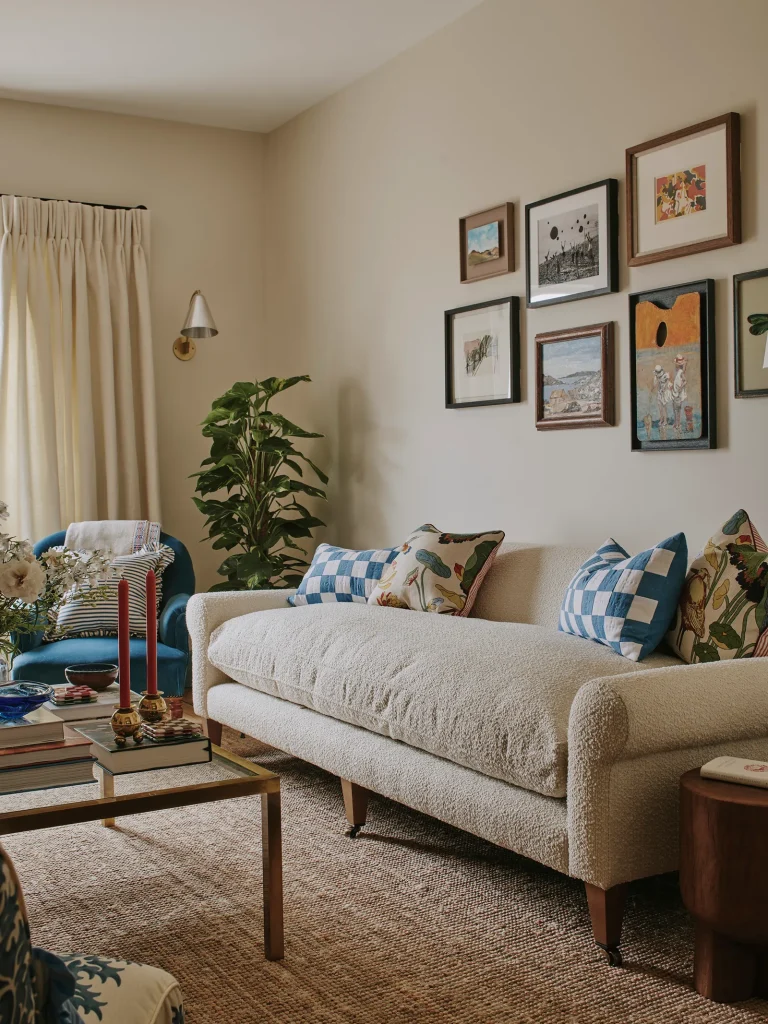
Bouclé sofas
Bouclé remains the upholstery equivalent of a deep exhale: soft, tactile, and undeniably comforting. And yet, its ubiquity has rendered it oddly invisible.
Marco Mansi, Features Writer, sees bouclé as “the safest choice in the room.” Comfort is assured, but character is less so. This year, he’s choosing furniture with more personality, even if it occasionally challenges the eye or demands compromise.
Blue everything
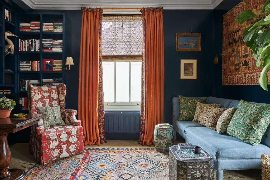
Blue has long been the decorator’s security blanket: reliable, flattering, and endlessly versatile. Its resurgence, particularly in darker shades, has made it almost unavoidable.
For Aida Amoako, Acting Features Writer, that’s precisely the problem. “I love blue — which is exactly why I need a break.” After one final flourish (a bookshelf in Hague Blue), she’s determined to explore unfamiliar palettes, resisting the comfort of the known.
Tiny prints
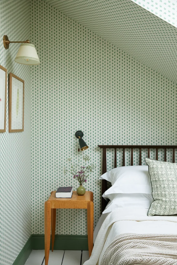
Small-scale repeating prints are beloved for their delicacy, but in compact spaces they can feel oppressive rather than charming.
One contributor notes that high ceilings and bold furniture demand visual breathing room. “Even as a committed maximalist, there is such a thing as too much.” Sometimes, restraint, rather than pattern, delivers the strongest statement.
Read More: Inside a Frank Gehry Masterpiece Transformed Into a Modern Art Sanctuary
FAQs
Are these trends “out” for 2026?
Not at all. These trends are very much in circulation and will look wonderful in the right hands. This is about personal response, not universal rules.
Can trends still work if adapted?
Absolutely. A single brown accent, a touch of blue, or wallpaper in a well-ventilated cloakroom can be far more effective than full immersion.
How should I decide which trends to follow?
Consider longevity, emotional response, and how a space makes you feel day-to-day. Trends should enhance your life, not dictate it.
Is it better to ignore trends altogether?
Not necessarily. Trends can be inspiring and useful, but best treated as suggestions rather than instructions.
Conclusion
Trends offer a snapshot of our collective mood, what we crave, fear, or aspire to at a particular moment. But the most successful interiors are rarely trend-led alone. They are shaped by memory, instinct, compromise, and the quiet understanding that homes must support real lives. In 2026, the House & Garden team is choosing discernment over devotion: admiring from afar, editing ruthlessly, and prioritising spaces that feel personal, enduring, and quietly joyful. After all, the best trend of all is knowing when to say no.
